


Dressing for Your Skin Tone: A Practical Guide to Colour
Some colours make you look rested and bright; others make you look tired, even in a piece you love. Usually the difference is how the colour sits against your skin. This guide shows you how to work out your undertone, which shades tend to suit it, and how to use that when you shop. Treat it as a starting point, not a set of rules.
Skin tone and undertone are different things
Skin tone is how light or deep your skin is: fair, medium or deep. It can shift with the seasons and with sun.
Undertone is the colour beneath the surface, and it stays the same. It is usually described as warm (golden, peachy), cool (pink, rosy) or neutral (a mix of both). Many people also have an olive undertone, a greenish cast that sits between the two.
Any skin tone can have any undertone. Fair skin can be warm; deep skin can be cool. Undertone is what decides which colours flatter you most.
Finding your undertone: three quick checks
Do these in natural daylight, with a clean face. No single test is conclusive, so look for the answer that comes up most often.
- The fabric test (most reliable). Hold something pure white and something soft ivory under your chin. If crisp white makes your skin look clearer, you likely lean cool. If ivory looks kinder and white looks harsh, you likely lean warm. If both look fine, you may be neutral.
- The jewellery test. Notice whether gold or silver looks more natural against your skin. Gold often favours warm undertones, silver cool ones. Neutral undertones tend to wear both.
- The vein test (a rough guide). Look at the veins on the inside of your wrist. Mostly blue or purple suggests cool; mostly green suggests warm; hard to tell suggests neutral. Skin thickness and lighting affect this, so use it to confirm the other two, not on its own.
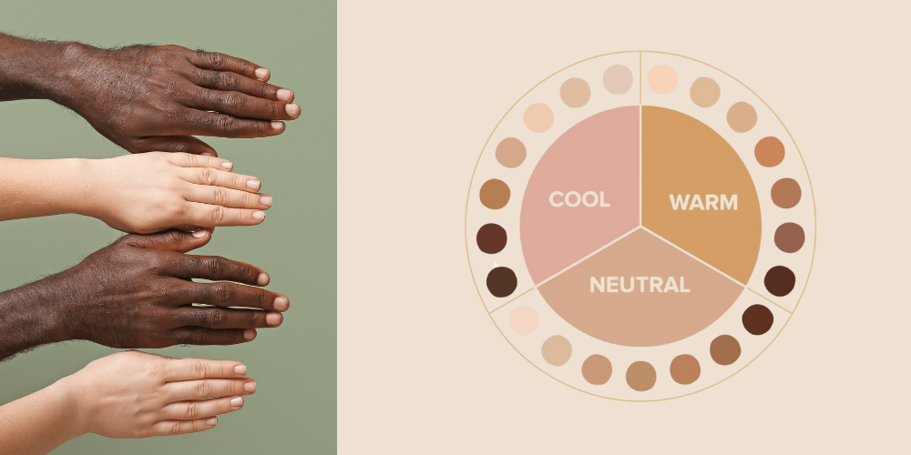
If your skin reads slightly green or grey in some light, and neither gold nor silver looks quite right, you may have an olive undertone.
Colours that suit each undertone
| Undertone | Neutrals to build on | Colours to try | Use with care near the face |
|---|---|---|---|
| Warm | Ivory, cream, camel, chocolate brown | Rust, terracotta, olive, mustard, coral, tomato red, warm teal | Icy pastels, stark white, cool grey |
| Cool | Pure white, charcoal, cool grey, navy | Emerald, sapphire, berry, ruby red, lavender, icy pink | Orange, mustard, camel |
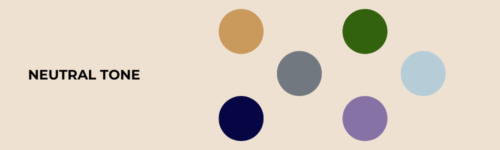
| Neutral | Stone, taupe, soft white, navy | Dusty rose, jade, soft teal, true red, sage | Very bright neon shades |
| Olive | Cream, khaki, warm grey, espresso | Forest green, aubergine, teal, rust, plum, burgundy | Pale yellow, mint, washed-out pastels |
These are tendencies, not prohibitions. A colour from the last column can still work lower down the body, in a print, or broken up with a flattering scarf or collar.
Pieces to try in your palette
- Warm: the Roll Neck Micro Modal Top in cream, chocolate or taupe; the Collared Linen T-shirt in mango or crimson; the Alpaca Plaid Scarf in natural or brown.
- Cool: the Scoop Neck Cotton Modal T-Shirt in white, lavender or light blue; the Striped Cotton Roll Neck in royal blue or violet; the Two Tone Baby Alpaca Scarf in aquamarine or pink.
- Neutral: the Sleeveless Micro Modal Vest Top in taupe or peach; the Mock Neck Micro Modal Top in navy or cream.
- Olive: the Long Sleeve Striped Linen T-shirt in olive; the Scottish Cashmere Neckwarmer in burgundy.
Depth and contrast
Once you know your undertone, look at contrast: the difference between your skin, hair and eyes. It tells you how strong your colours can be.
- Low contrast (for example fair skin with light hair, or similar depth across skin, hair and eyes): softer, tonal outfits tend to look most harmonious. Very bold colour blocking or stark black-and-white can overpower.
- Medium contrast: you can carry most mid-strength colours. Pair a richer shade with a softer neutral rather than two very strong ones.
- High contrast (for example fair skin with very dark hair, or deep skin with bright eyes or silver hair): saturated colours, crisp white and black, and sharp colour pairings tend to look striking.
Deep skin tones are often flattered by rich, saturated shades such as cobalt, fuchsia, emerald and ochre. Pastels can work too, especially in clear rather than dusty versions. As always, undertone is the better guide than depth alone.
What the colour "seasons" mean
You may have heard people described as a Spring, Summer, Autumn or Winter. In colour analysis, these are personal palettes, not times of year. Each combines undertone with how light and how vivid your colouring is.
| Season | Undertone | Character | Typical shades |
|---|---|---|---|
| Spring | Warm | Light, clear, fresh | Peach, coral, warm aqua, golden yellow |
| Summer | Cool | Light to medium, soft | Powder blue, dusty rose, lavender, soft grey |
| Autumn | Warm | Rich, muted, earthy | Rust, olive, camel, mustard, deep teal |
| Winter | Cool | High contrast, vivid | True white, black, emerald, sapphire, berry |

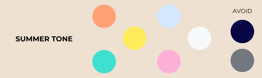

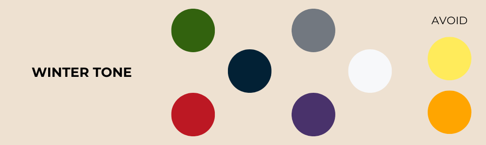
You don't need to fit a season neatly. Many people sit between two. The undertone table above is a simpler way in.
Putting it into practice
- Keep your best colours closest to your face. Tops, knitwear, scarves and collars matter most. Trousers and skirts can be any shade you like.
- Build on the right neutral. Swapping black for navy, or stark white for ivory, often makes more difference than any bright colour. Our Long Sleeve Crew Neck and Crew Neck T-shirts come in navy, white and black, and the Crew Neck in cream.
- Let texture help. Natural fabrics such as linen, modal and Scottish cashmere soften a colour, so a shade that looks harsh in a shiny synthetic can look gentle in a matte knit.
- Test before you commit. When trying something on, look at your face first, not the garment. If your eyes look brighter and your skin more even, it's a good colour for you.
Once you know your palette, browse New Arrivals or our women's T-shirts with it in mind.
Explore more from Lavender Hill
Shop
Find your fit
Our fabrics
Read next